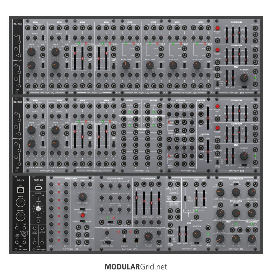
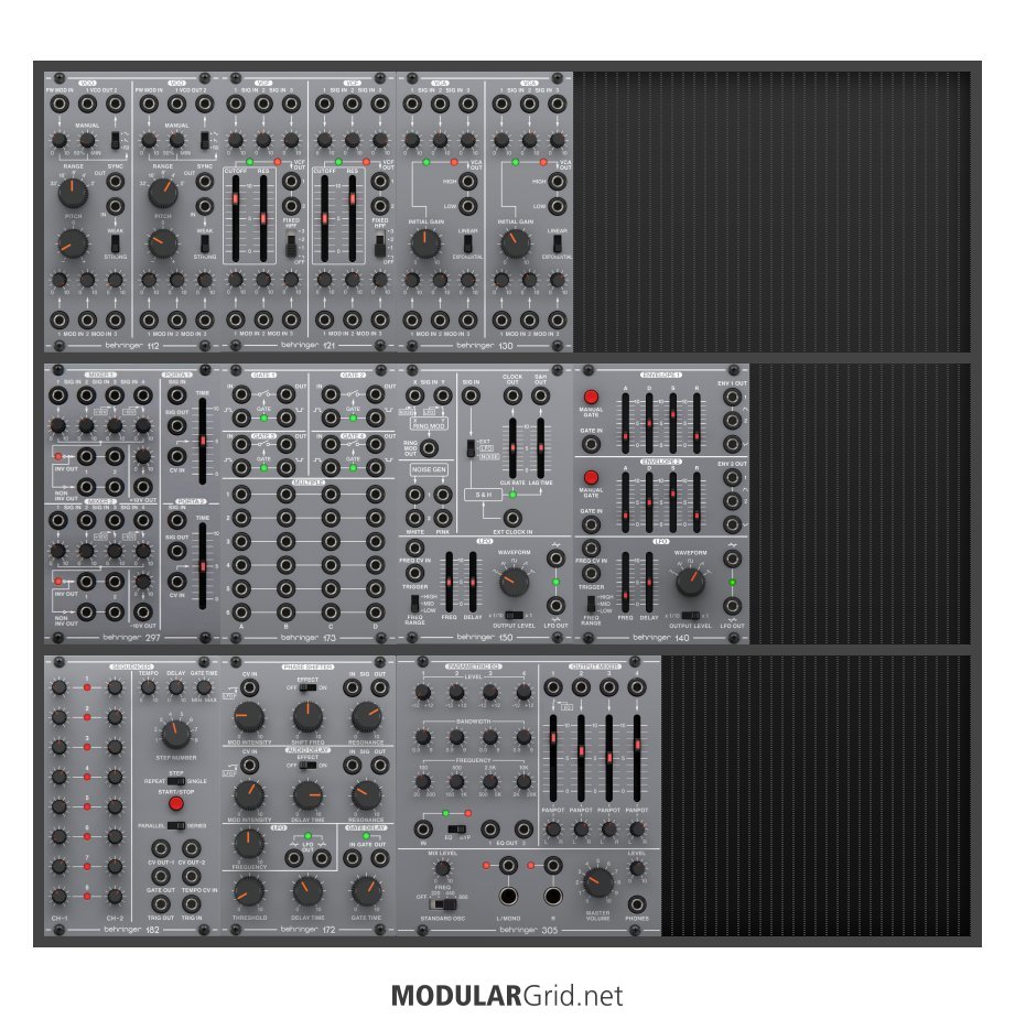
Unfortunately I cannot fit this on 2 rows, which would have been a lot neater.
definitely not something I'd worry about
I am pretty happy with the layout, but appreciate any suggestions on position changes that will improve workflow.
I'd move the vcas up to the top row, the mixer down to the bottom row and the middle 3 of the bottom row to the middle row...
I am also looking for suggestions for additional modules. I'd love to keep it all looking uniform, if at all possible, but realise that that is pretty unlikely. I have a random assortment of other modules lying around, so I'll have no trouble filling up the space, but I want something that both looks and sounds good.
I'd want more utilities... matrix mixer, more vcas (probably a quad cascading one like a veils clone or similar, they're for cv as well as audio), at least one clock divider (square wave sub bass from audio: /2 = -1ve, /4 = -2ve) , some logic, mults, at least a dual quantizer, attenuation/attenuversion/offset (happy nerding 3 * mia for example) etc
Possibly a Pams Pro... not just clock but also lots of triggers, gates, modulation... I'd keep the clock divider above (for the reason stated) and the logic (useful outside of Pams) - but a couple of the Pams channels could be used for quantization - and/or quantized stepped random...
An extra filter might be an idea... something that sounds different...
Also, thoughts on powering? I could use 2 microZeus, but would consider trying different power options (I've only used the Zeus in the past).
I like befaco power supplies - especially the excalibus... simple, but tedious DIY, or ready built... much quieter than the uZeus and avoids the rack wart...
"some of the best base-level info to remember can be found in Jim's sigfile" @Lugia
Utility modules are the dull polish that makes the shiny modules actually shine!!!
sound sources < sound modifiers < modulation sources < utilities


