I totally agree! A couple days ago I happened to post a similar request on the ModWiggler forum:

From https://modwiggler.com/forum/viewtopic.php?p=4237599#p4237599

One gripe I have about module entries that are "Approved by manufacturer" locked is that many manufacturers are not very good at keeping on top of updating their modules on ModularGrid! And the method of getting the manufacturers to update changes or correct mistakes by sending a message is sort of tedious/cumbersome and no guarantee that the change will take place or the request even read, since ModularGrid is often a low priority for them or worse yet they've gone out of business or passed on. 😔

I think a better method might be to set up a "Pending Change" status so that end users can use the normal tools to make changes to a locked "Approved by manufacturer" module but the changes wouldn't take place until the manufacturer takes action on the pending request (approves, rejects, or doesn't respond for a certain period of time, at least a week but no more than a month?) While a request is pending no more changes/pending requests can be made on that module. This way it would be more streamlined for both users and manufacturers and modules that were locked by manufacturers that don't care or are MIA can still be updated in a reasonable amount of time. (which will also reduce the need to end users to create duplicate module entries that can be edited)


Whoops, I understand now! 🤦‍♂️😄

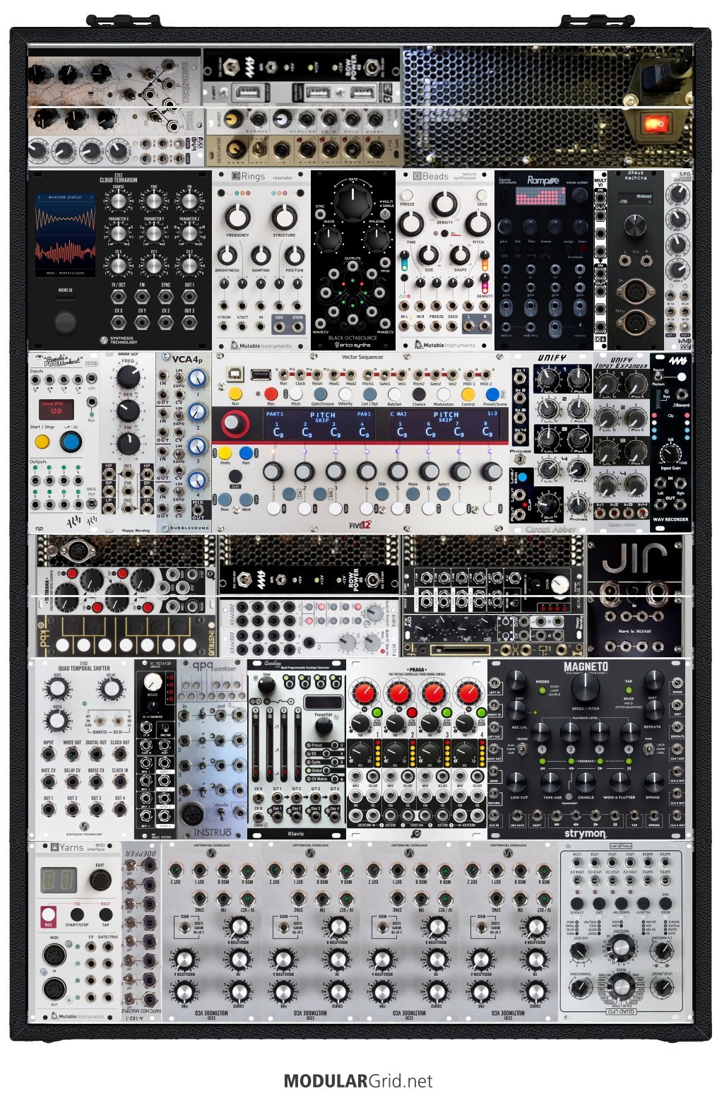
I use a photo editing program to create custom images for custom modules. So in ModularGrid create your rack with one or more empty 1U sections and then download images of the modules you want to have in there. (it's also helpful to grab a screen shot of the whole case) In your photo editing app rotate the modules and then proportionally resize them so that they are the correct size relative to your rack size and then paste them into the rack screen shot. Fill up the entire width of the rack with what you need and then select 1u tall sections that are the entire width of your case and save that as a new image. Then in modular grid add your new private 1U images and when you are done you can load those super wide 1U modules into your rack. If you want your power and cost metrics for the rack to be accurate, in the notes section list all of the modules and the individual costs and power requirements and then add them up manually and put the totals in the correct places. Since I wind up with some modules spanning across two 1U sections I just put the totals in the bottom 1U section and then set the top 1U section to uses no power and costs $0.

It's a real pain to do, especially when modules span across 1U sections because I don't have the skills or patience to split the images perfectly and usually settle for "close enough". Some times when rearranging the case I'll avoid making changes in those sections just because I know I'll have to do all of the tedious work to make the ModularGrid image look correct! 😒😅 In fact I have several changes I've made that I need to update but have been putting it off for months! 😊

Good luck on getting yours setup!

Ah I know, I have a case with a sideways section myself :) I meant in the modulargrid planner :)

Hey could I ask how you did the sideways modules? Are they custom entries as 1U or something?
-- quantumi Hi, they are just standard 3U modules mounted sideways in my DIY custom rail frame. You can see some details of what the lower and upper frames look like starting just before the 22:00 minute mark in the video. :-)

-- JohnLRice

-- quantumi


Hey could I ask how you did the sideways modules? Are they custom entries as 1U or something?
-- quantumi Hi, they are just standard 3U modules mounted sideways in my DIY custom rail frame. You can see some details of what the lower and upper frames look like starting just before the 22:00 minute mark in the video. :-)


A dream toolbox. I remain speechless, and yet I regularly follow your adventures on Instagram... Respect.
-- Sweelinck Thanks again for your nice compliments my friend! :-)


Thanks very much, Sweelinck, I'm glad you liked it! :-)


Video breakdown for this system:


Video breakdown for this system (this one is now setup to run on an attached battery):


Video breakdown for this system (quite a few changes since this video was made!):


Video breakdown for this system:


Thread: JLR 5U Box11

Video breakdown for this system:


Video breakdown for this system:


Thread: JLR 5U QPC22

Video breakdown for this system:


John L Rice> > ...click on "My Modular" it takes me to the last Eurorack system I had looked at...

-- JohnLRice

my experience is that "My Modular" always shows the rack with the most recent changes. But maybe i am wrong...
-- modular01

OK, I did some testing and it's becoming more clear what is happening:

When ModularGrid loads, it defaults to Eurorack, with the upper left hand dropdown and main page blue buttons set to Eurorack and the information on the page about Eurorack. This setting seems to govern what MyModular will show when clicked, so even if my last session was editing an MU modular, by default a new session will load the last edited Eurorack modular. But if I set the format dropdown or click the blue button for the desired format and then click MyModular it takes me to the actual last edited modular.

What was confusing is that even within a particular session, if I was editing an MU modular and then went to the Command Center and just opened up a rack in a different format to look at it but didn't change anything and then clicked on MyModular to try to get back to the MU modular I was just working on, it would instead take me to the last rack I had edited in the format I had just looked at.

Now that I know what is going on it won't be so confusing but it would be nicer IMHO for those of us who work with multiple formats if the database or cookies or what ever is used to remember user actions would initially load ModularGrid in the format type that was last edited by the user, and/or if clicking MyModular would go to the actual last edited rack regardless of current page format settings?

It's not the end of the world and I can live with it if need be. ;-) At least maybe my post will help someone else that is as confused as I was?


If I open up a fresh browser window and click on "My Modular" it takes me to the last Eurorack system I had looked at, even though the last system I might have had open was a MU or MOTM system. Once I bring up a MU system and then go to the information for a particular MU module and then click "My Modular" it takes me back to the correct MU system.

It's been like this for several years at least. It took me a long time to decide what I think is going on, at first I thought I was getting hacked, and then I thought maybe MG was remembering the last system someone else besides me looked at? But it seems that maybe there is just something missing in the cookies/code/database that isn't handling MU/MOTM systems?

I'm using up to date Windows 10 and Google Chrome browser, I haven't tried other OS or browsers and I haven't checked if other module formats are remembered correctly or not.

Thanks for looking into it!
John L Rice


maybe a property like "pedal", "foot operated" or "floor device" that can be activated in the search filter would make sense!?
-- modular01

Yeah. 👍 Maybe a checkbox like there is for "Show other/unknown" but instead would say something like "Show other devices" and would be unchecked by default. And then there would be a property in the submit/edit pedal options that reads "This is not a foot pedal" to put them in the category of "other device"?

I suppose to get the ball rolling if that option was added MG could use a script to check the "This is not a foot pedal" for all entries that are not from known pedal manufacturers? Of course some will get checked that shouldn't be and vice versa but it should catch most?


I think all the desktop devices like the small synths make kind of sense and we think we should keep the modular user in focus with all his gear. That user does not stomp on the pedals but has them sitting on the table next to his sequencer and drum machine.

Exactly! I've made many setups that incorporate both pedals and other devices like small mixers, synths, power conditioners, patch bays, clocks, recording devices, etc. and often are built onto actual PedalTrain pedalboards (or sometimes into rack cases). A majority of the time these will sit on a table/desk and are operated by hand.


It would be very helpful to be able to rotate modules 90 and 270 degrees to be placed into 1U rows! I have one custom case in particular that has two approximate 2U sections that is a pain to keep updated in MG because I have to take the time to photo edit custom images for custom modules and then do manual calculations for the power requirements of all modules in the section. It's particularly difficult to get modules that are split across two 1u sections to look right! 😅
ModularGrid Rack


Agreed! I was just searching this subject. I don't want to change a bunch of other peoples racks just because I want the non-standard knobs on my module to be represented in my ModularGrid rack. I "could" create a separate hidden module but it seems a waste of time and server space. hmmm, maybe I'll upload my panel version, and then right away upload a copy of the current panel version?

Maybe a check box next to the panel image upload button the is labeled "Make This Image The Default?" or a popup prompt etc would be good?


Such a beautiful build!!! Kudos! You should post this to ModWiggler if you haven't yet? :-)


Ahh, nice! 👍


Hi,

I don't know what the current draw is for the +12v eurorack version is but FWIW below is what I measured for the +-15v 5U version.
75 mA +15V
27 mA -15V
0 mA 5V

At least that might give you an idea? It will probably draw more current at the lower voltage of +-12v so below is a calculation based on the numbers above but . . . . I may be wrong so don't quote me! ;-)
94 mA +12V
34 mA -12V
0 mA 5V

John


Thread: Bug Report

After the recent site update, when viewing an individual rack it's stretched too tall or something so that the bottom of the rack covers up the statistic information (like the total power usage and costs, etc) I'm using Windows 10 and Google Chrome browser on a PC laptop.


Thread: Change Log

Hi,

In general the changes look nice. One issue I've seen is that the racks are stretched too tall or something and the bottom of the racks cover up the stats (like the power usage and costs, etc) EDIT: I forgot to mention I'm using Windows 10 and Google Chrome browser on a PC laptop.

And unfortunately for me . . . one thing I've been taking advantage of for a long time is the fact that the command window used to only show 4 racks horizontally, and my main system happens to be 4 racks wide (and 4 racks tall) so I could carefully name my racks in such a way that they would line up in the same order as my physical system. Now that the Command window allows 7 racks horizontally I had to add 3 filler racks on each of the 4 rows to get my alignment back. Oh well . . . .


Thread: Bug Report

Hi, same problem here, 4 row limit on any device/computer... :(
-- Oracio Hi, this is easily solved if you pay to upgrade your account to UNICORN level! ;-) See this link:
https://www.modulargrid.net/e/users/pro_index


Thread: Change Log

Depth in search results

If you sort by depth the actual module depth is displayed in the module boxes beside the HP info.
Modules without an assigned depth will be excluded from the result.
-- modulargrid


I was thinking that if possible, it might nicer if the Info, Zoom, Rotate and Trash icons were in a sub-popup menu that is opened by clicking on a single icon

They are too prominent, in the way? You can hide them quickly by pressing ESC.
-- solitud

This is SO much better now, thanks for the recent improvement!


Thread: Bug Report

I've been thinking it would be nice to have a checkbox for sort parameters that would "Exclude Modules Missing Parameter" to more quickly find what we are looking for. This would be particularly great when searching for modules with a maximum depth since, as it is now, all of the modules that don't have a depth parameter entered are all at the beginning (when sorting ascending) which of course makes sense BUT since there is no way to tell how deep a module is short of adding it to a rack or going to the info page for the module it is a bit laborious to find a shallow module.

Or maybe it would just be more efficient to just add a little grey box with the depth next to the grey box with the HP size?


Not sure about that. I managed to fit an ADDAC812VU which is 35 mm deep, with no problems.
-- ParanormalPatroler hhhmmmm, weird. I measured mine with fairly decent digital caliper.


Ideally, with those 4ms pods, could a mismatch in depth be highlighted?
-- liquid_air

Unfortunately the data here cannot be fully trusted. I run into such an issue where the depth info both in MG and in the manufacturer's manual is not true, which made me purchase a module which ought to fit in a Pod but didn't. 2hp Rnd v1 still has depth set as 34mm last time I checked and I had to reach out to manufacturer for a change. Real depth is 45mm with power cable, 40mm without. Both are too deep for a Pod and I have no idea why they don't state the real depth.
-- ParanormalPatroler I know! I bought a 2hp NSE and it's deeper then stated and wont fit in a Pod.

Also 4ms seems to have over stated the Pod depth at 34.1mm, from my measurements 32mm and under will fit, under 33mm might fit, and over 33mm probably wont fit. Maybe their prototypes and/or manufacturing proofs were 34.1mm deep but the production copies ended up a little shallower?


Is there a way to have different rows to have different widths to plan module arrangements across different cases in one convenient location?
Say four rows 3U 88HP with an Intellijel 7U 104HP case.
-- liquid_air

You could just make one big case with many rows and then fill in the "shorter rows" with blind panels?


Request again for narrower racks please! ;-)
-- JohnLRice

O.k. 20HP min it is.
Working themes are Pittsburgh Cell Style and Geeklapeeno Cluster.
Everything else looks like an impossible Escher theme.
-- modulargrid

Thank you sir!


Request again for narrower racks please! ;-) Not only for 5U formats but now also for EURORACK, since 4ms has come out with their POD series, with the smallest being 20 hp (other sizes are 26, 32, and 60 hp). More info at link below:
https://4mscompany.com/pods.php

Maybe another reason to create the "simple black line" rack style so that even 1 hp racks would be doable?


buying and selling to members

-- FSK1138

We now have a marketplace with a nice search function and a notification feature!

-- modulargrid

I guess i'm over looking.. where's the search in the Marketplace?

Thanks,

-- dugoutcanoe

Hi,

There is a drop down selection in the module finder titled "Available In Marketplace" where you can select a few different ares of the world or global etc. It's nice because along with the other regular selections like Manufacturer, Function, Width etc you can quickly find out if there is a module for sale.


Cool piece, well done! I've dabbled with 12 tone composition from time to time and it can sometimes lead one to create something very cool they wouldn't have though of. I also recommend that if someone comes up with a 12 tone row that is almost perfect except for one or two notes and you can't make it work, go ahead and ignore the rules and fix it! ;-)


Yeah, like YIKES!

I've added the temporary version linked below and anyone can use it but be warned I'll take steps to delete it once TipTop's official version is usable again:
https://www.modulargrid.net/e/other-unknown-jlr-s-uzeus-2016


Someone needs a full modular I think...
-- norde

Modular synths are designed to work exactly like the drug pusher in a dark alley that says "Hey kid, first one is free" and then once you are hooked, it's near impossible to break the habit. While the first module usually isn't free, thinking you can get "just one module" is the same trap since the more you think about it the more you will realize you'll "just need one or two more modules" and "oh, a slightly bigger case" and "oh, I've got empty space now, I'll get a couple mores to fill it in" and "OH, I HAVE to have that new amazing module that was just released but I'm out of room so I'd better get another case too and . . "


While on the MU format subject, given that some other firms beside COTK are now doing half-height modules, might it be time to add a half-tier option to MU? Something similar to how 1U tiles work in Eurorack...much the same row selection method could be employed in the rack creation interface, I should think.
-- Lugia

Yes, that would be a welcome addition! :-)

The CP format has the same inconsistency problem between module heights that eurorack 1U tiles have. COTK CP modules are slightly taller at 147 mm then the ones everyone else makes at 143 mm. But I guess that's just something the end users need to be aware of before attempting to add CP modules to their physical systems.

Here's a thread on Muff's that discusses the differences:
https://www.muffwiggler.com/forum/viewtopic.php?t=120103


I was thinking that if possible, it might nicer if the Info, Zoom, Rotate and Trash icons were in a sub-popup menu that is opened by clicking on a single icon

They are too prominent, in the way? You can hide them quickly by pressing ESC.

True but they show up again as soon as the mouse/cursor moves. I think I'd prefer just a toggle button at the top to turn the
buttons off completely when I don't need them.

The log out period seems really short these days! It used to be too short for my liking and then it seemed to get longer and more recently it seems extremely short! :-(
If it creates too much of a burden on the server to have lots of people logged in, maybe time out could be a lot longer for Unicorn folks? ;-)

Mhh. I did not touch the settings in the past. Maybe some PHP update changed some INI. I have increased the values now. The server should handle the users we currently have just fine. In future there should be an US proxy though...

Thanks! I'm not sure how short it was but maybe only 15 or 20 minutes?

Small HP case sizes needed for MU and MOTM.
-- JohnLRice

A bit tricky. I have checked it, the graphics of most enclosures look scrambled with 2HP MU/MOTM...

Yeah, the cases with feet and corners etc would look weird but Shelf, Pittsburgh Cell Style, Geeklapeeno Cluster might work? Or maybe there could be an "invisible" enclosure that is just a solid black or grey line, sort of like the "No Board" option for pedalboards but still acting like the other enclosures?

Synthesizers.com sells 1, 2 and 4 MU (hp) enclosures with or without wood sides:
https://www.synthesizers.com/qcb124.html
https://www.synthesizers.com/products/qcb124/qcb124_1000.jpg

Thanks for listening and considering requests! :-)


Small HP case sizes needed for MU and MOTM.

There are commercially available cases the hold as little as 2 MU modules so it would be nice if this were possible in ModularGrid. I know a 2 HP case in eurorack would be pretty ridiculous but in large format modulars it's quite reasonable.


The log out period seems really short these days! It used to be too short for my liking and then it seemed to get longer and more recently it seems extremely short! :-(

If it creates too much of a burden on the server to have lots of people logged in, maybe time out could be a lot longer for Unicorn folks? ;-)


I was thinking that if possible, it might nicer if the Info, Zoom, Rotate and Trash icons were in a sub-popup menu that is opened by clicking on a single icon (like a grey one with three ellipsis/dots). The reason I suggest this is because the 4 icons now cover over half the module face of 4 hp and smaller eurorack modules.

I wouldn't mind if the buttons were smaller also but I know that would make it harder for mobile users.

Alternatively maybe just a new option button next to Popover Off etc that would toggle the buttons on and off? Sometimes I just want to move modules around quickly and don't need and options but the buttons slow down doing so.


... if I turn the Popover off, the spinner icon doesn't disappear along with the Info and Trash icons.
-- JohnLRice

That should be fixed now.
-- modulargrid

Thanks much! I checked on both a eurorack modular and a pedalboard and can confirm it is working.


I am taking notes, John, but I don't promise anything ;)
-- modulargrid


Actually, is there a MG rule on that? I'm never sure if I should put a module that was DIY'd into a different format under the manufacturer of the "guts" or if it should be under Other/Unknown??
-- JohnLRice

It's a bit tricky. While DIYers want to show respect by labeling their builds with the inventors brand, some manufacturers don't want to have DIY modules labeled with their brand. Our suggestion is to better not label DIY builds because if manufacturers complain we remove them anyway.
-- modulargrid

Thanks! :-)


My pleasure.

I also try to help keep things maintained by marking any custom modules I create as "private" and sometimes contacting people who have posted duplicates to let them know about the previous version and how to delete the one they created etc

Sometimes I don't take the time though . . . .


I see! :-) After I posted I wonder if maybe you were doing lots of modulation and didn't need so many mixers.

Although, have you considered the Moon 592 Modulation Matrix? Might be handy for combining modulation sources and routing them to destinations during a live performance?
http://www.lunar-experience.com/assets/downloads/592_2s.pdf


Hi David,

I think what I did was to take an image of any standard 5U tall module that is the same number of units/hp wide as the CP image I wanted to create and then placed the perfectly trimmed CP image over the top of it. I then selected everything below the CP image and replaced it with the solid color. The hardest part is just proportionally resizing one or the other image so that they are exactly the same width.

One sad thing to note, not all CP panels are the same height! :-/ Details are in the thread below, basically COTK CP modules are a little taller then how everyone else makes their CP modules.
https://www.muffwiggler.com/forum/viewtopic.php?t=120103

But if you use the method I described, you wont have to worry about the height measurements since the U/hp widths are consistent.


Haha, looks pretty impressive! :-)

I didn't look at it for too long but it seems pretty light on mixers for that many VCOs?


12